It’s all about balance. We’ve all heard that before. From the food we eat to how we manage our time, we maintain a balance between this or that to live harmoniously. Too much of one thing can cause boredom on one end and chaos on another.
Whether we realize it or not, we’re drawn to balance in art and photography. To put it simply, if an image is well-balanced, a viewer’s gaze will travel across the entirety of the photo. There’s a main focus or focal point but the other elements provide support and guidance in the image. Each element plays a special role with guiding attention.
Visual weight
In photography, this psychological tug for attention is called visual weight. Different characteristics carry varying degrees of visual weight. Here’s an obvious one: the bold color of red. From road signs to movies, the color immediately alerts our attention to warn us.
These days, everyone has a sophisticated camera on their smartphones. With that in mind, a variety of composition rules can now be widely applied. Knowing what carries or lacks visual weight is fairly simple. However, creating balance is the challenge. Let’s explore several examples, including work from our own CSU photographers.
Humans and animals
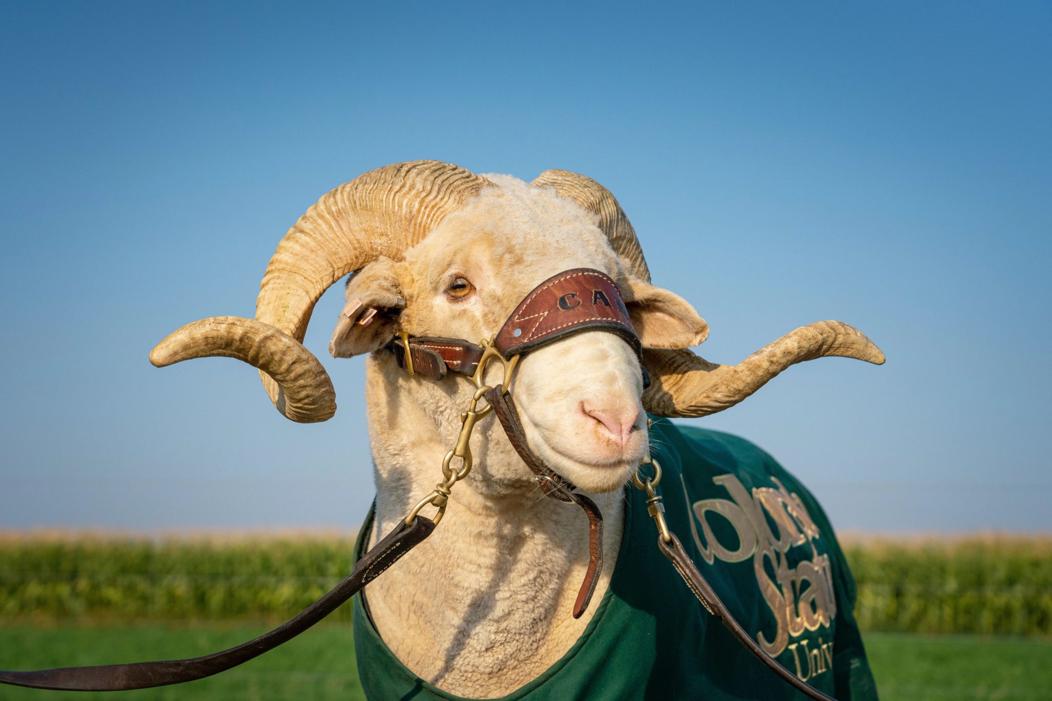
This shouldn’t come as any surprise. Our brains are wired to look at faces and eyes first. If there’s a face or animal in your photo, make sure it’s your main focus. If it isn’t, consider avoiding them. Thus, eyes and faces carry heavy visual weight.
If the eyes of your subject are looking off-camera, mind the space between his or her eyes and the edge of the frame the subject is looking towards. We tend to want to look in the direction of those eyes.
Size and shape
When it comes to sizes of objects, larger objects have more visual weight than smaller objects. We see them first and spend more of our gaze on them. Seems obvious, but actually heavy things that weigh a lot have ample visual weight, too.
However, smaller objects can overpower larger objects if they carry more weight in a different way. For instance, a brightly-colored, small object can grab attention faster than a nearby, dull-colored large object.
Colors and contrast
Colors and contrast can sometimes outplay size and shape. Our eyes are naturally attracted to areas of high contrast. This can include the darkest or lightest object or area. It depends on what it’s surrounded by and if it stands out. For example, a bright object with a dark background, or vice versa, makes a subject pop. A pop of unexpected color or light is heavier in visual weight.
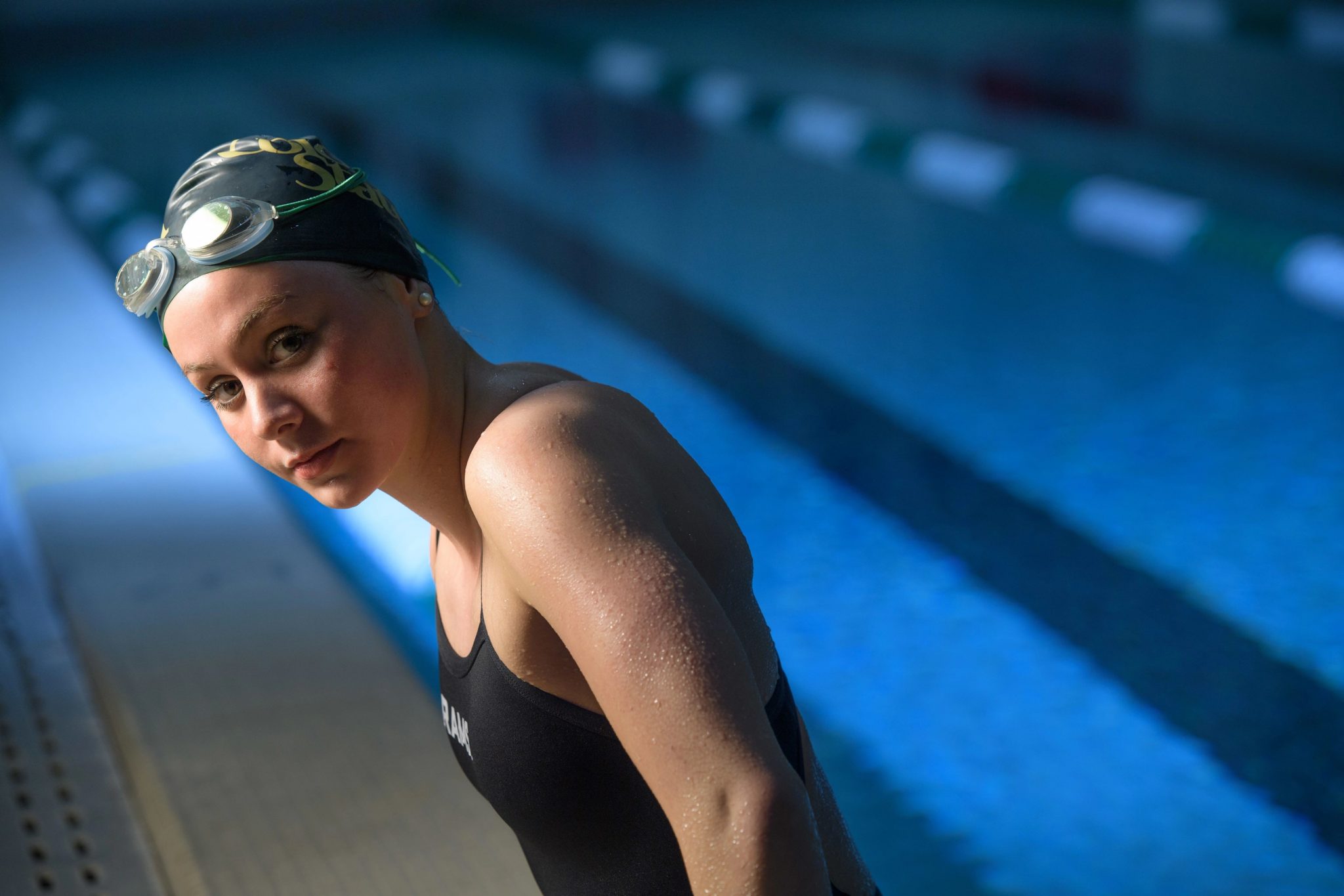
When it comes to color, luminance and saturation has more influence than hue itself. Generally, warm colors advance into the foreground and tend to weigh more than cool colors, which recede into the background. However, blue can possess decent weight if it’s deep, dark, and saturated.
Position and placement
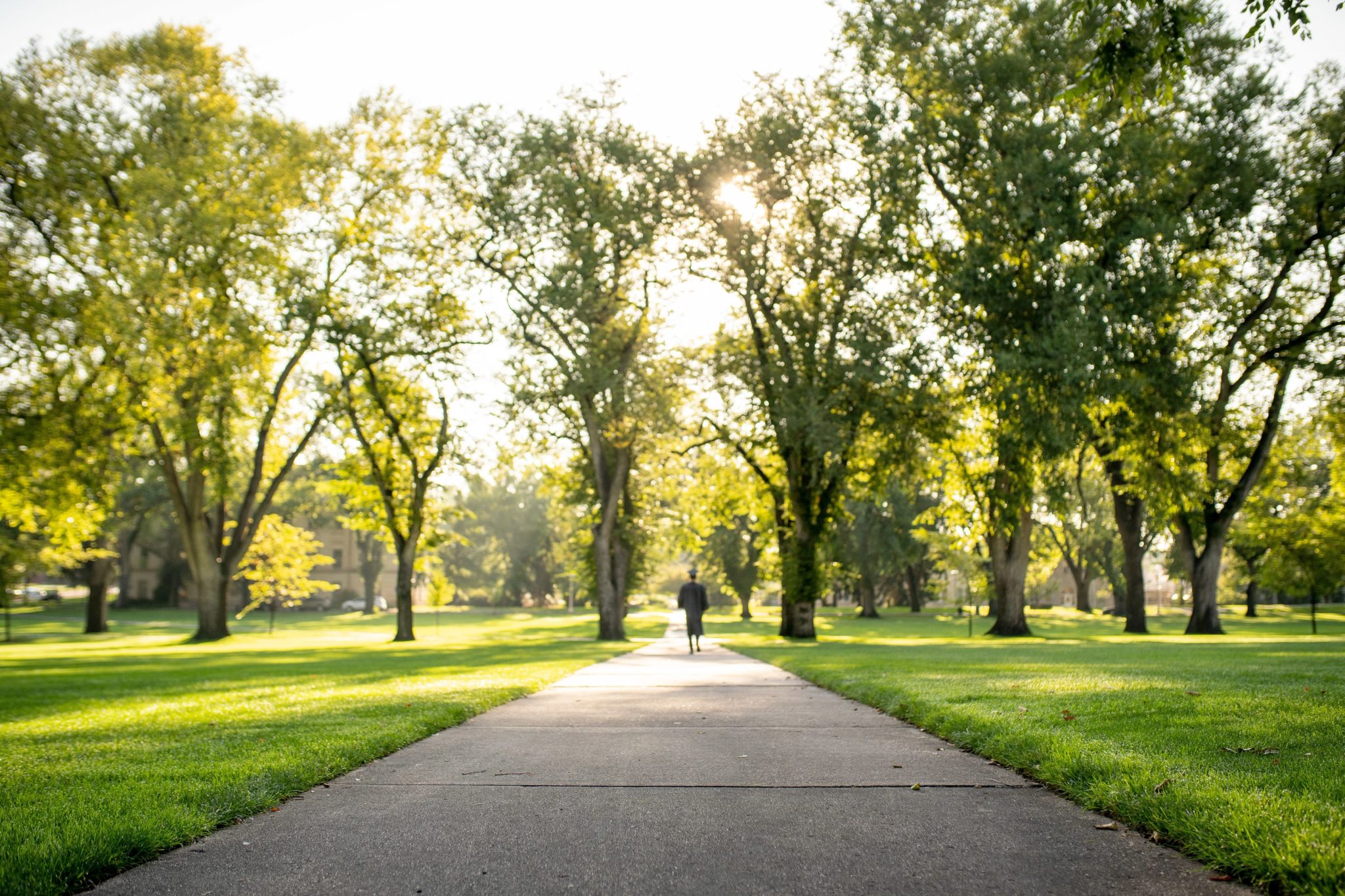
It’s largely known that off-centered subjects create more interest in composition, unless symmetry or artistic intent is involved. Visual weight increases as objects move further from the center.
Alignment also impacts visual weight. Diagonal orientation carries more weight than vertical or horizontal lines. Framing a subject with a bit of a tilt creates more drama.

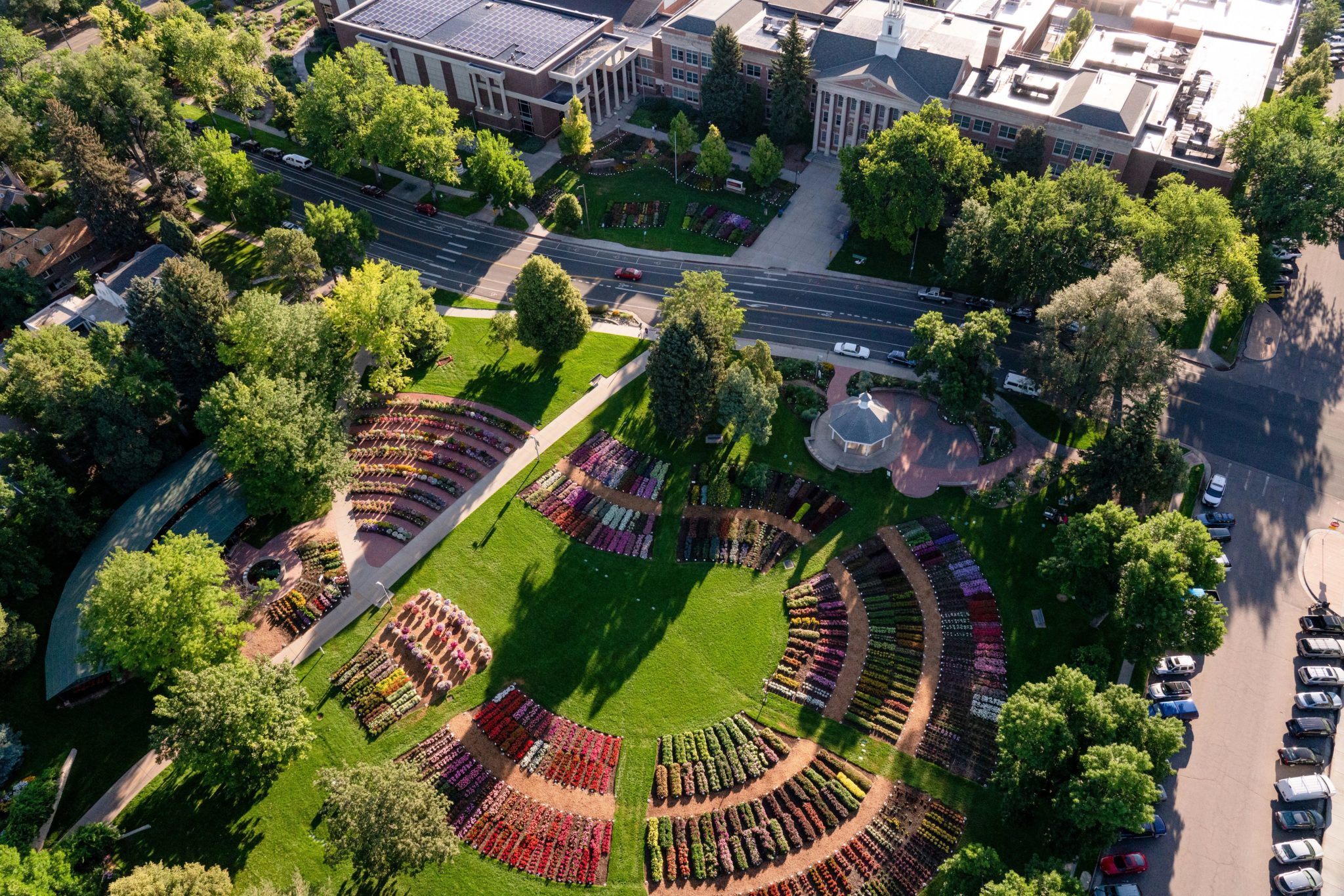
Textures and patterns
Our eyes are drawn to textures. Smooth areas are lighter in weight than textured areas. In addition, patterns are also pleasing to our eyes. We’re entranced by repetition. If you’re trying to balance one larger object in the frame, you can use multiple smaller objects elsewhere.
Find a balance
Depending on your subject or focal point, think about how much weight it carries. Observe the surrounding environment to identify other elements as counterweights. Different parts of the image should carry visual weight throughout, without competing with the main idea.
Most of us crave balance and if we see imbalance, we want to correct it. Too much of one thing is never good.
Interesting, well-balanced compositions have a flow to them. They’ll become uninterested or uncomfortable if they’re constrained to one spot. Of course, sometimes tension, not balance, is the artistic goal. Rules are meant to be broken, but after you learn them first.