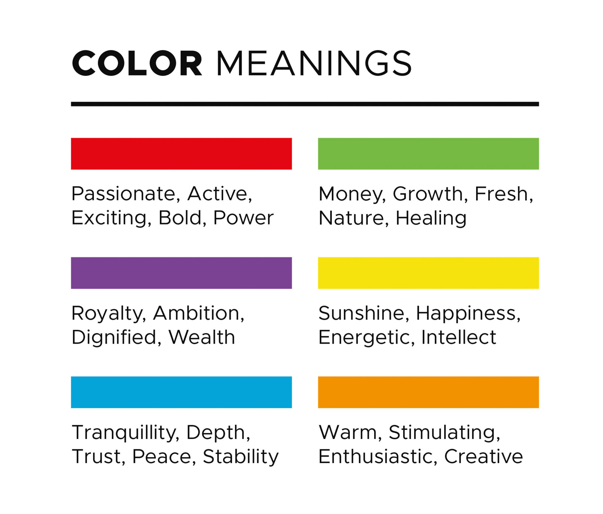
Color has a powerful psychological impact on feelings and emotions. We’ve grown up associating colors with particular meanings. The color red often represents passion, energy, and love. The color yellow evokes a feeling of joy, while the color blue brings a sense of calm. Whether we realize it or not, color affects people on a subconscious level.
Color theory explains how humans perceive colors and apply these meanings. It’s a science leveraged by artists and designers. In the realm of filmmaking and visual storytelling, colors are used to convey emotion, provide context, and to create an aesthetic.
Not only does color establish a mood, it also signifies a transition within films. Color can be used to separate dreamy memories from present reality. It is also a tool to show change within a character’s development. Let’s further explore how color theory informs film and video.
Revisiting color theory basics
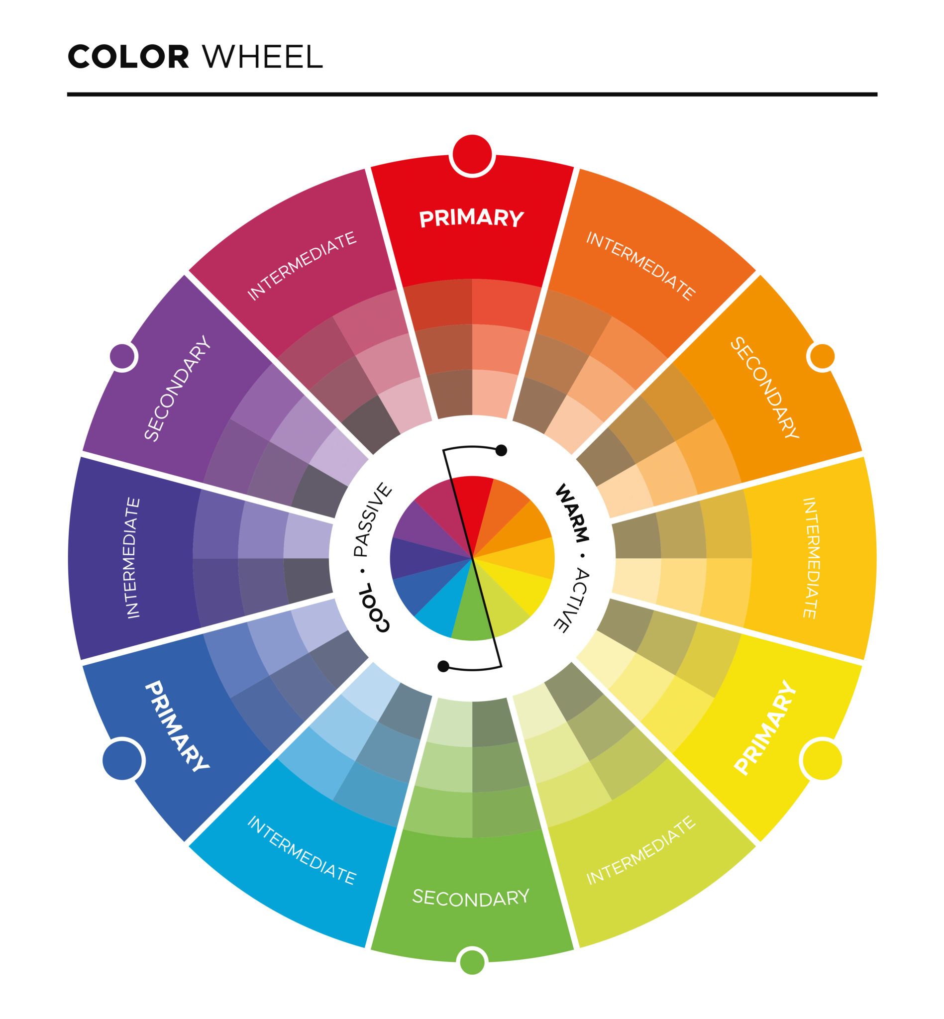
First, let’s start with a few basics. We’re throwing it back to grade school. Remember the color wheel? There’s three sets of colors that together make up a color wheel. The primary colors are red, yellow, and blue. These colors cannot be created by any combination of other colors. Secondary colors are formed by mixing primary colors. This includes green, orange, and purple. Finally, tertiary colors are made by mixing a primary and secondary color. These hues have two-word names, like red-violet or yellow-orange.
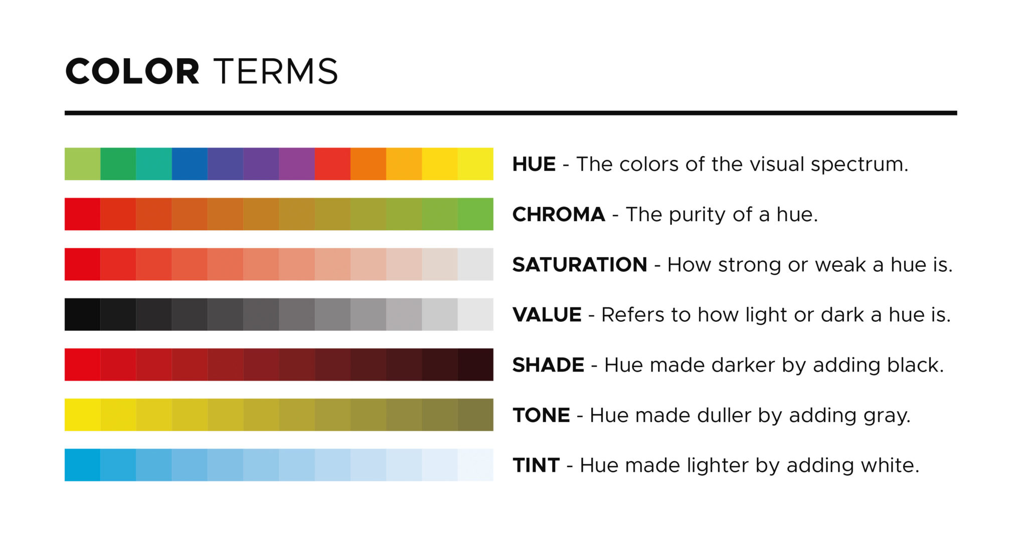
Secondly, let’s review saturation, hue, and value. These three elements are adjusted during the color grading process to create a specific look. Hue is the actual color or shade itself. Saturation is the intensity of the hue. It’s the hue’s vividness or how colorful the hue is. is the lightness or darkness of the hue.
Applying color theory to video
When color theory is applied in video editing to set a tone or aesthetic, this is considered as color grading. As a quick note, color grading is different from color correction. Color correction is merely correcting the image and its colors. This includes correcting white balance to ensure that the image looks as natural to the human eye as possible. Color correction precedes color grading. Once that’s done, you’re able to tweak the image to stylize the footage.
There’s a variety of combinations and arrangements of colors used by artists. These color palettes are either pleasing to the eye or serve an aesthetic or narrative purpose. These combinations are called color schemes. Color schemes are named by how the hues relate to one another by their position on the color wheel.

Monochromatic schemes use one color throughout the scene, with variations in saturation and other values to create depth. The Matrix is a good example of a monochromatic color palette. Green is found everywhere, and it accentuates the feeling of living in a simulated dystopia.
Complementary color schemes use colors on opposite ends of the color wheel. Opposites attract, and these hues go well together. There’s one cool color and one warm color, or one primary color and another secondary color. Examples include red and green or yellow and purple. In cinematography, orange and teal is a complementary color scheme that’s used quite often.
There are many examples of films that use complementary color schemes, from Wonder Woman to La La Land. It’s an easy go-to for filmmakers, as skin tones can be accentuated into orange to pop against backgrounds like the sky. Complementary colors are used to create harmonic contrast that’s striking and attractive to the eye.
Analogous schemes use groups of colors that neighbor one another on the color wheel. Unlike complementary colors, analogous schemes have less contrast. This scheme can both evoke serenity as well as anxiety from oppressive uniformity.
Here’s an example of a scene using analogous colors in the film Moonlight. These shades of purple and blues neighbor one another on the color wheel. Films typically use either warm or cool analogous colors, depending on the theme of the film.
The triadic color scheme involves three colors that are spaced evenly between one another on the color wheel. This scheme is used less frequently than the others. It’s a more challenging scheme to work with, but it’s still present in several popular movies. For instance, the Superman films are a great example of the use of red, blue, and yellow, all of which lay evenly from one another on the color wheel.
Final thoughts
The schemes discussed thus far are “balanced” color schemes. These schemes include hues with harmonious relationships to one another on the color wheel. Rules are, of course, meant to be broken once they’re learned.
Venturing out of balanced color schemes has to come with intention. Discordant color schemes are deliberate to specifically bring out a person, place, or thing. For instance, a bright yellow jacket in a blue, dark morning doesn’t have a sense of harmony, but it does draw the eye into the subject in yellow. Discordant colors also convey a feeling of chaos, instability, and madness.
The power of color is hiding beneath the surface of many works of art, not just film. Like music and dance, it can be a universal language that subtly sways minds and thoughts. It’s an invitation into a shared space, a funnel of immersion.